As a web design company it?s crucial to stay intuitive of the direction that design and development is going. ?We don?t want our clients to have an anachronistic site design and be behind of their competition, so we?ve done a little research. One thing about all design that?s unquestionable is that everything is getting more and more simplified for users. The simpler the design, the better. We?ve drawn out a list of 5 trends that any entrepreneur should be aware of as we approach mid 2014, especially for start ups, ?or companies revamping their identity.
1. Flat & Simple Design.
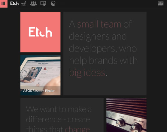
It looks so far that we're goodbye to drop shadows and gradients. Those were two ?go-tos? that a lot of designers would you to jazz up their design. This simplistic approach is leading designers to think outside the box, using icons and flat colors to be the foundations of design. Notice in 2013 Apple relaunched their new iOS7 and everything become 1 dimensional and simplified shortly after Windows 8 became all solid colors and easy to navigate as well. So far we've start to see this trend expand to smaller businesses. Not investigating of who was the trend setter to ?flat? design , but we can definitely agree that this will continue in 2014.
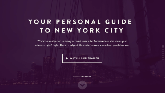
2. Heroes Are Becoming the New Sliders

If you haven?t heard of a hero area yet, you will by the end of 2014. It?s pretty much the ?intro/top? part of the website. Instead of a slider, you?ll start to see a larger slider, or just an image taking over the entire background of the website with very little text Let?s face it, people don?t like to read much and prefer imagery to guide to help understand something rather than doing much investigation. So ?the simpler the better? approach doesn?t only apply to icons, but to the reading as well. Check out this List 25 Sites with Heroes to get a better understanding of a hero area.
3. Cards/Tiles Will Continue to Grow
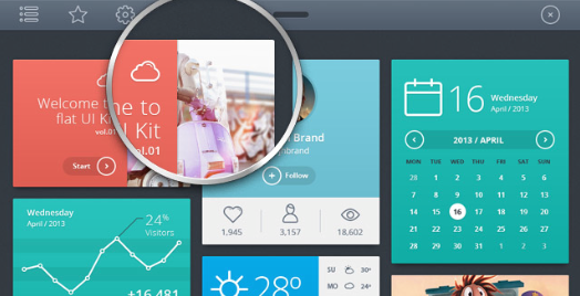
As we design for clients we?re noticing that there is a re-architecture for the web that?s straying away from pages to cards This is driving websites from having many pages of content linked together, pieces aggregated togehter into one experience. . Content is starting to become broken down into cards mainly because almost all website are (and should soon be responsive). Cards make is easier to re-aggrate for the rise of mobile technologies, and other screens of unique shapes and sizes.
4. Mobile is Becoming the Primary
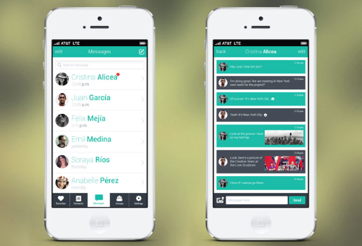
Because almost every website is becoming responsive, we?re starting to notice website with a deeper focus into the mobile lifestyle. Designers and developers are more focused on working their sites into mobile devices. This is very common with small businesses and will continue to grow. More people access the internet on their phone and other mobile devices such as tablets and pads. The typical layout designed just lap tops and computers
5. Less Text.
Towards the end of 2013 we noticed that the web has become less text-heavy. Even some apps have almost no visible text and relying on icons, videos and images t convey information to users. In a lot fo cases it works very well, for example for Snapchat homepage, which contains less than 10 words and requiring users to watch the video to make sense of the app.
Possibly Related Posts:
- Tips for Starting Your Own E-Commerce Website (more research)
- Things To Know When Naming Your Business
- 5 Web Design Mistakes that Small Businesses Should Avoid
- Reasons Why WordPress is the Best Choice for Your Business.
- A New Skin for PoeyFarre